Your Color Theory Guide to Website Design
Introduction to Color Theory
What is color theory?
Color theory is a set of principles used to create harmonious color combinations.
These principles guide the use of colors in art and design, influencing how they mix, contrast, and complement each other. It's a blend of science and art, and it plays an important role in visual communication.
Typically, color theory is made up of these core components:
1. The Color Wheel (more below)
2. Primary, Secondary, Tertiary Colors (more below)
3. Color Harmony: when colors together create an aesthetically pleasing arrangement
4. Color Schemes (more below)
5. Warm and Cool Colors: Warm colors (reds, oranges, yellows) evoke warmth and energy. Cool colors (blues, greens, purples) suggest calm and relaxation.
6. Color Psychology: Colors can evoke certain feelings or reactions. For example, yellow can feel energizing, while pink can feel soothing.
7. Color in Design: In design, color theory principles are applied to create style, appeal, and effective communication. It considers visibility, readability, and user experience.
READ MORE:
Color Theory and Web Design
Designing your website and stuck in the color aspect? That happens to a lot of people I talk with, you are not alone!
Color theory is key in web design for several reasons. It's about how colors mix, match, and contrast. This theory will help ya create a vibe that matches your brand’s message.
Color theory:
01. Sets the Mood
Colors can make a website feel welcoming or professional. For example, blue often feels trustworthy. Green can let you in know you’re on a financial services page, like Nerdwallet.
02. Guides the Viewer
Color can direct users where to look. It highlights buttons or areas you want them to notice.
03. Brand Recognition
Colors help brands stand out. Think of the specific shade of red Coca-Cola uses. That same principle applies to web design. Make it easy for your dream clients to recognize your brand.
04. Usability
Good color choices make sites easier to use. They ensure text is readable and elements are visible to everyone, including those with visual impairments.
5. Emotional Impact
Colors affect how we feel. A website that uses colors well can make us feel calm, excited, or inspired.
So, color theory combines science and art to create effective, appealing websites. It's about more than looking pretty - think about communication and function.
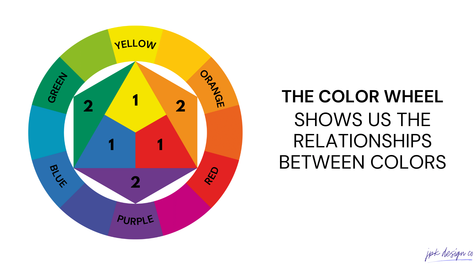
What is the Color Wheel?
The color wheel is basically just a visual representation of colors arranged according to their relationship with each other.
It starts with primary colors: red, blue, and yellow.
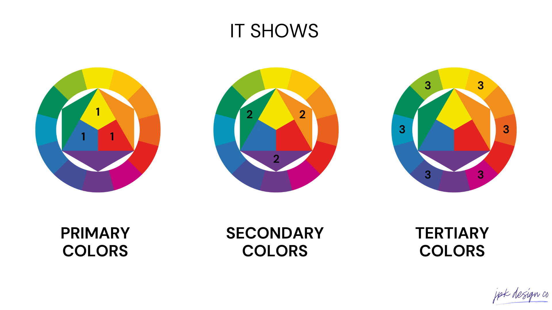
These then are the foundation for creating secondary and tertiary colors:
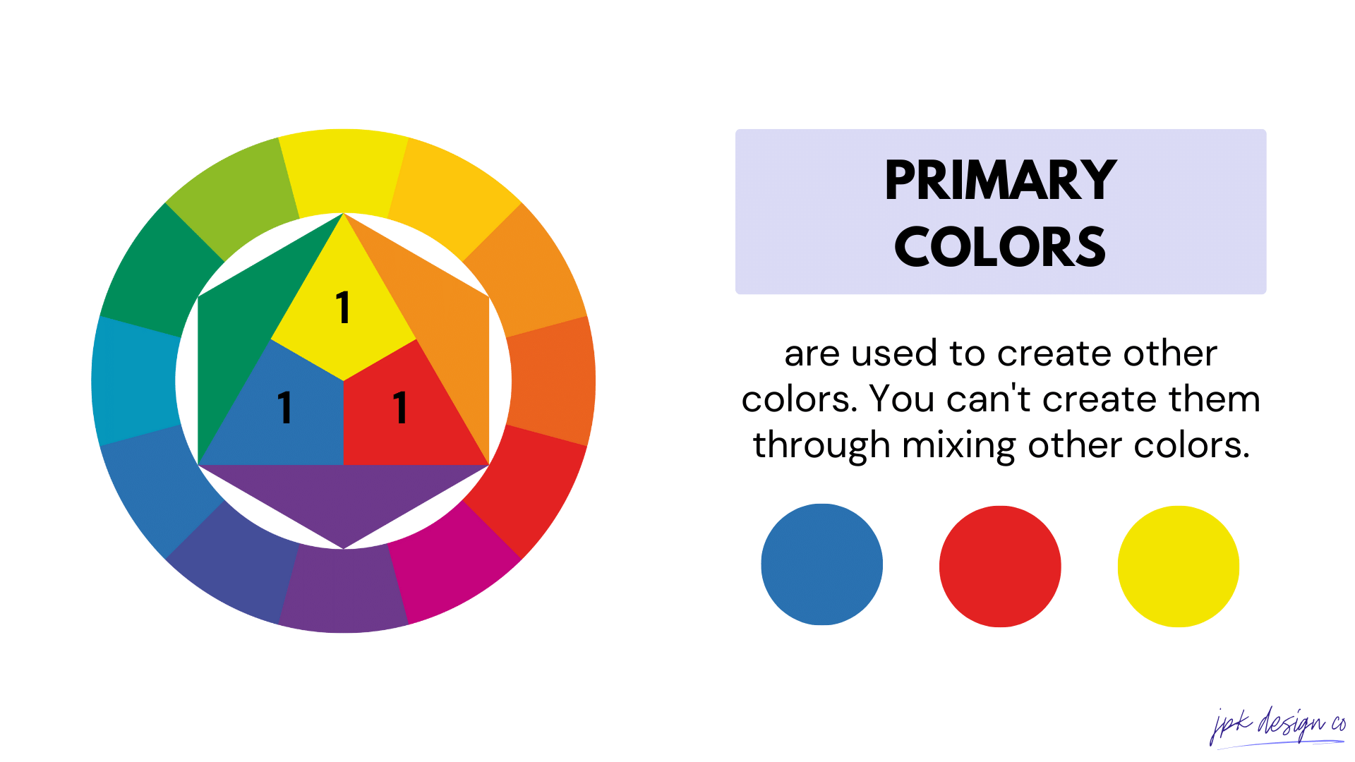
01. Primary Colors: Red, blue, and yellow. They’re called "primary" because you can't create them by mixing other colors. They are the foundation of all other colors on the wheel.
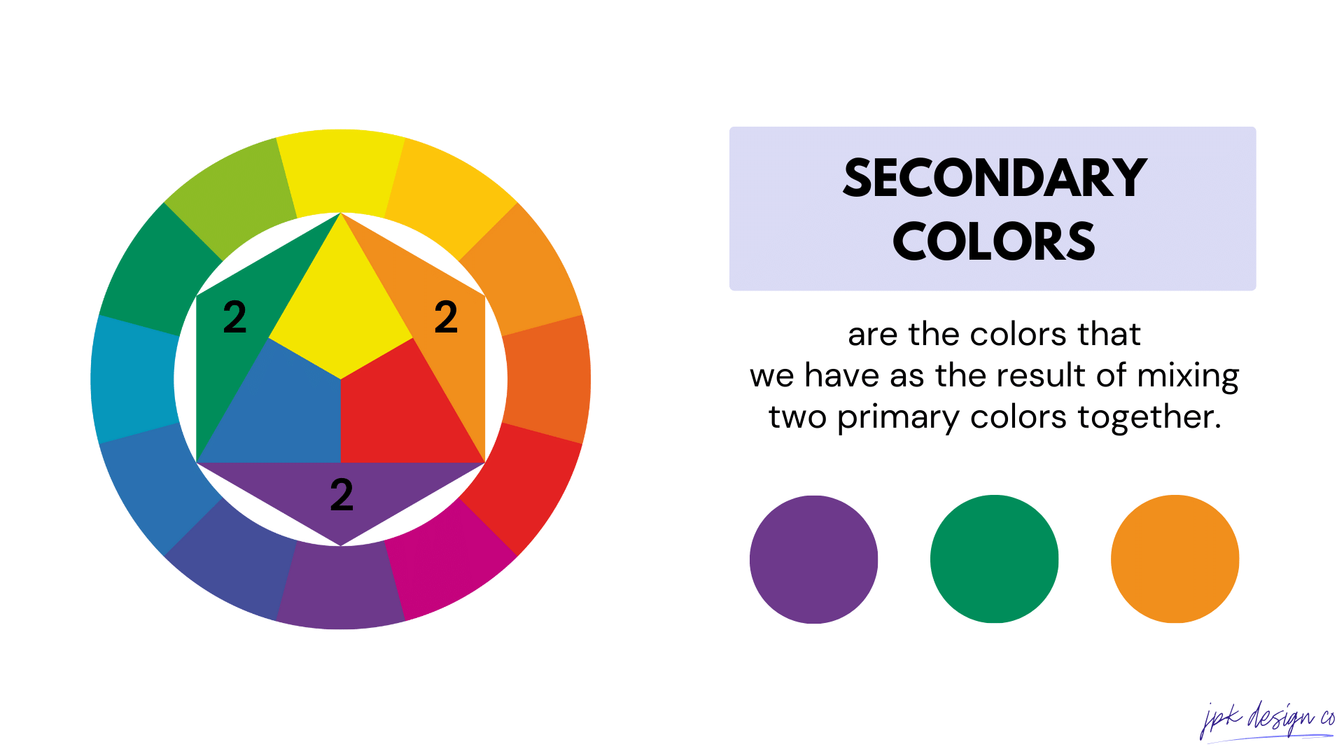
02. Secondary Colors: Created by mixing two primary colors. For example, red and yellow make orange, yellow and blue make green, and blue and red make purple. These colors sit between the primary colors on the wheel.
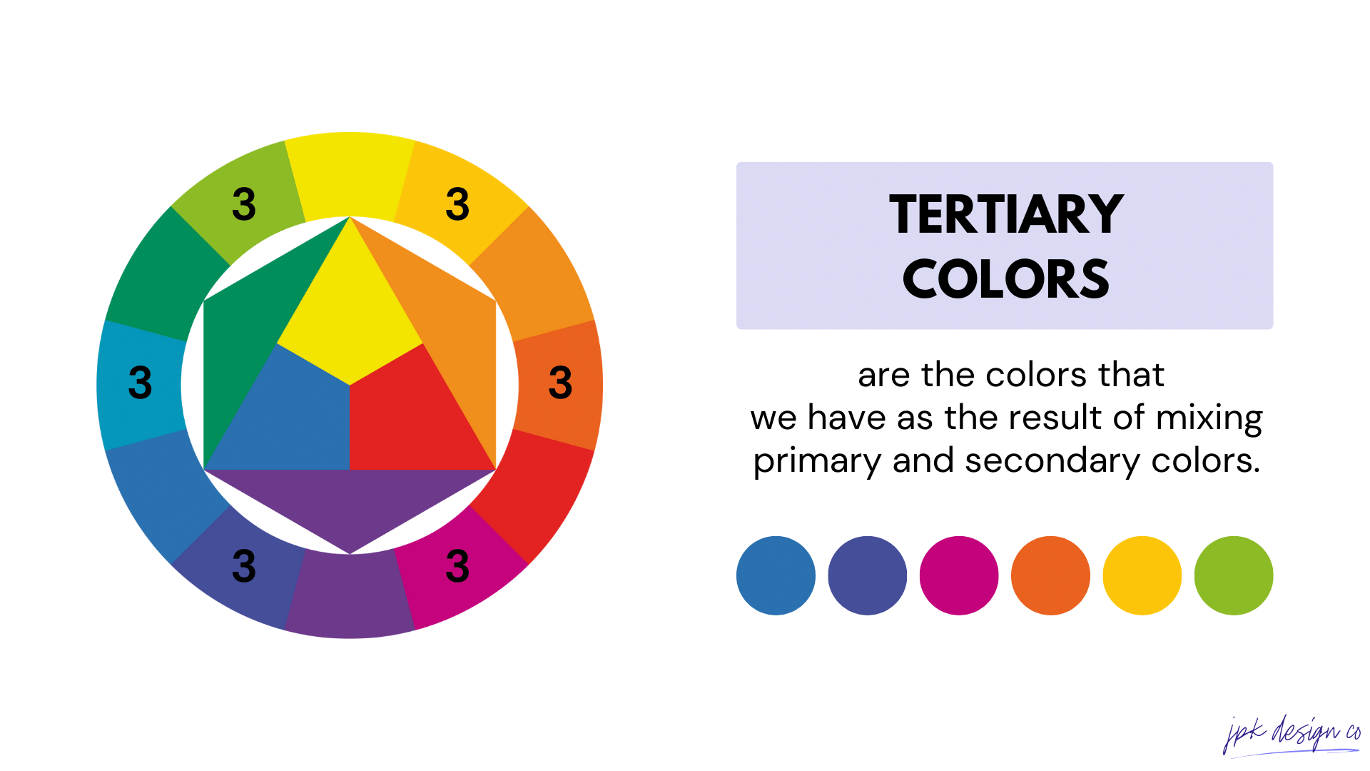
03. Tertiary Colors: These are made by mixing a primary color with a neighboring secondary color. This results in six hues: red-orange, yellow-orange, yellow-green, blue-green, blue-purple, and red-purple. They fill the gaps on the wheel between the primary and secondary colors, creating a more nuanced spectrum.
Color Schemes: Color Combinations
Color combinations are specific sets of colors chosen based on their relationship on the color wheel.
Okee dokes. So now let’s look at these color schemes, and examples of brands using each of them.
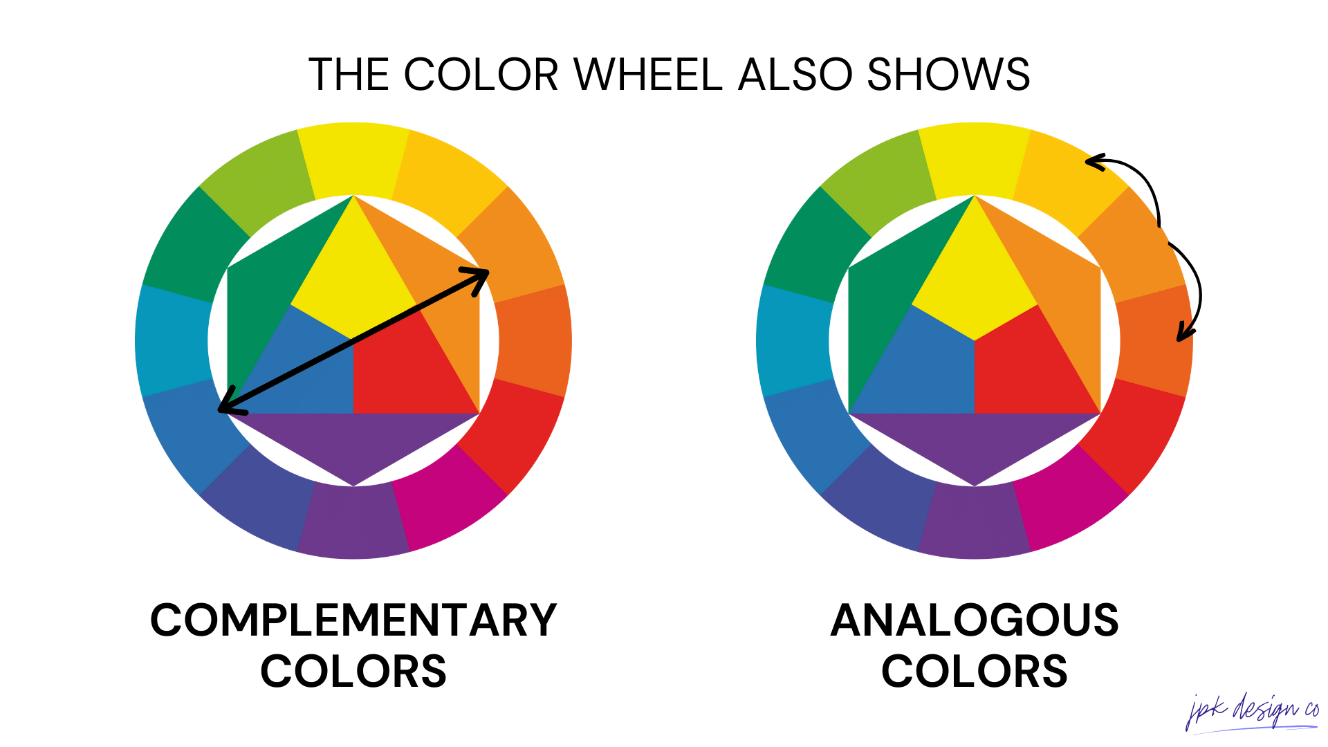
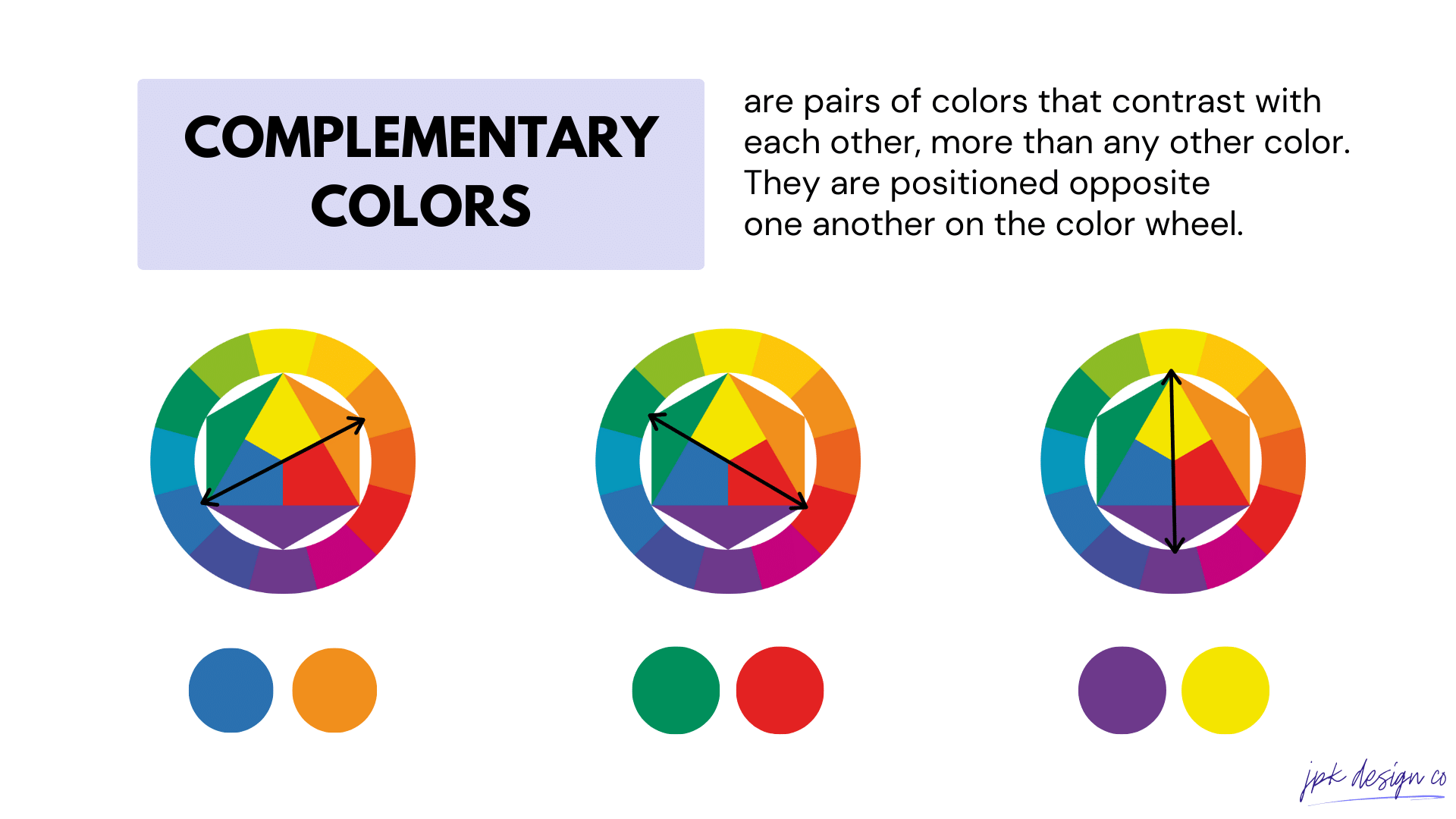
01. Complementary Colors
Complementary colors are directly opposite each other on the color wheel. This creates a high contrast and vibrant look, making each color appear more vivid. You’ll see this combo used a lot in design.
EXAMPLES:
Blue and and Orange
Yellow and Purple
Red and Green
Teal and Maroon
Pros: These combinations create a vibrant and high contrast look.
Cons: If used excessively or without balance, they can be overpowering.

COMPLIMENTARY COLOR BRAND EXAMPLE:
FedEx
Color Scheme: Purple and Orange
The orange represents energy and precision, while the purple conveys trust and reliability. Together, these colors make the FedEx logo highly recognizable and memorable.
02. Monochromatic Colors
Monochromatic color schemes are all the shades, tones, and tints of a single base color. When you use monochromatic colors, you’ll want to get variance by adjusting the saturation and brightness. You’ll want to keep contrast in mind for accessibility with this color scheme.
EXAMPLES:
Blue Monochromatic
Green Monochromatic
Red Monochromatic
Yellow Monochromatic
Pros: It's harmonious and easy on the eyes, creating a cohesive and elegant look.
Cons: It can sometimes lack the diversity and contrast seen in other schemes.
MONOCHROMATIC COLOR BRAND EXAMPLE:
Apple
Color Scheme: Shades of Gray and Black
Application: The monochromatic scheme conveys sophistication, simplicity, and elegance, aligning with Apple’s brand identity of high-quality, cutting-edge technology.
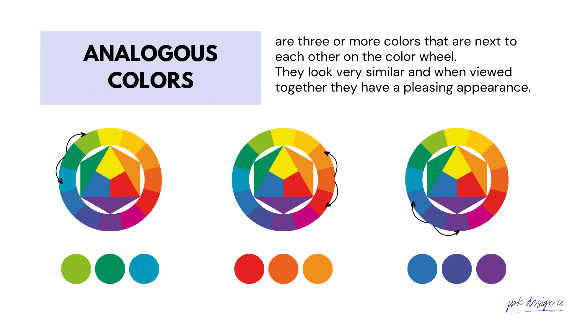
03. Analogous Colors
Analogous colors are groups of three colors that are next to each other on the color wheel. They work well together, but you’ll still need to have a good balance. Typically, one color is used as the dominant color, while the others complement it.
EXAMPLES:
Red, Red-Orange, and Orange: warm and lively
Blue, Blue-Green, and Green: calming and cool
Yellow, Yellow-Green, and Green: vibrant and full of life
Violet, Red-Violet, and Red:deep and rich
Pros: They usually match well and create serene and comfortable designs.
Cons: They lack the diversity and contrast that can make a design pop.
ANALOGOUS COLOR BRAND EXAMPLE:
Instagram:
Color Scheme: Violet, Red-Violet, and Red
Application: The Analogous color scheme creates a warm, vibrant, and welcoming gradient that is indicative of the platform’s creative and dynamic nature.
04. Triadic Colors
Triadic colors are a set of three colors that evenly spaced around the color wheel. Using triadic colors can make your site pop.
EXAMPLES:
Red, Yellow, and Blue: The primary color triad.
Green, Orange, and Purple: The secondary color triad
Cyan, Magenta, and Yellow: These are the primary colors in the CMYK color model (used in color printing)
Red-Orange, Yellow-Green, and Blue-Violet: A tertiary color triad.
Pros: This scheme offers vibrant color while retaining balance and color richness.
Cons: If not balanced well, the colors can compete for attention.
TRIADIC COLOR BRAND EXAMPLE:
Google:
Color Scheme: Blue, Red, Yellow, and Green
Application: Although technically using a quad-color scheme, Google's logo exemplifies the use of triadic colors (blue, red, yellow) with the addition of green. Each color is equally spaced around the color wheel.
Accessibility Considerations
As you’re choosing colors for your website, it’s important to pick and utilize colors that will be accessible to all.
Here are a few things to keep in mind:
Contrast Ratios: Ensure sufficient contrast between text and its background to make content readable for everyone, including those with low vision. The Web Content Accessibility Guidelines (WCAG) recommend a minimum contrast ratio of 4.5:1 for normal text and 3:1 for large text.
Color Blindness: Design with color blindness in mind by choosing color combinations that are distinguishable to people with various types of color vision deficiencies. Tools like Color Oracle can simulate how your colors appear to those with color blindness.
Avoid Color Alone for Information: Don’t rely solely on color to convey information. Ensure that messages are still understandable without color, using text labels, patterns, or shapes to communicate critical information.
Use Tools for Testing: Utilize accessibility tools and plugins, such as the Color Contrast Checker by WebAIM or the aXe Accessibility Testing Tool (Chrome Browser extension link), to test your website’s color palette for accessibility compliance.