How to Use Color Psychology to Create an On-Brand Website
Color Psychology in Web Design: How to Make Your Site Emotionally Magnetic
You know that wild shift between "I'll just grab toothpaste at Target" and walking out with a new lamp, throw pillows, and somehow... a waffle maker? Your impulse control isn't the culprit here – it's color psychology working its magic.
Ever notice how certain websites just feel right while others make you want to click away faster than you can say "bad UX"? That's no accident. Colors shape emotions and influence decisions on your website in ways most visitors never consciously realize.
A meditation app with aggressive red branding would make about as much sense as a high-intensity workout app in sleepy lavender. (Your bounce rates would have something to say about either choice.)
Before You Pick Your Palette: The Strategy Behind the Spectrum
Before you start playing with that color picker like it's a new toy, let's get strategic about what your website actually needs to accomplish. Your website colors aren't just about what looks pretty – they're silent salespeople guiding visitor emotions and actions.
Ask yourself:
What's your website's primary purpose? E-commerce, service-based, corporate, or non-profit? Each has different emotional needs.
How should visitors feel when they land on your site? Excited, reassured, inspired, or something else entirely?
What's your authentic brand personality? Professional and trustworthy? Playful and creative? Premium and exclusive?
The answers to these questions should drive your color choices far more than personal preference or current trends. (Yes, even if millennial pink is your absolute favorite.)
Cultural Color Meanings: The Global Perspective
Here's something that trips up even experienced designers – colors speak different languages depending on who's looking at them.
In Western cultures, red might scream "danger!" or "excitement!" while in Chinese culture, it whispers "good fortune" and "celebration." White, which might represent fresh beginnings to some, is deeply associated with mourning in many Asian traditions.
This isn't just interesting trivia. If you're designing for a global audience or wanting to make sure you’re designing inclusively, these cultural perspectives can mean the difference between connecting with your visitors or accidentally sending the wrong message entirely.
Frequently Associated Emotions and Meanings with Colors
Red: The Conversion Champion
Associations: Passion, excitement, "add to cart now"
Red brings the same energy as that client who sends emails in all caps – impossible to ignore and demanding action. Perfect for call-to-action buttons, less ideal for "mindful spending" messaging.
Brand Examples:
Coca-Cola
Netflix
Target
Canon
YouTube

Orange: The Enthusiasm Builder
Associations: Energy, excitement, playfulness, warmth
Orange keeps that pre-launch campaign energy going strong. It's bold, it's attention-grabbing, and it's impossible to ignore.
Brand Examples:
Fanta
Amazon
Home Depot
Nickelodeon
EasyJet

Yellow: The Attention Grabber
Associations: Energy, fun, brightness, happiness, caution
Yellow radiates the same energy as your favorite productivity app's notification badges. Use it when you need to highlight something important.
Brand Examples:
McDonald's
Snapchat
IKEA
DHL
Best Buy

Green: The Growth Guru
Associations: Nature, growth, money, eco-friendliness
Green brings balance to your brand like a well-organized project management system. It works especially well in health, wellness, finance, and outdoor industries.
Brand Examples:
Starbucks
Whole Foods Market
Spotify
Nerd Wallet
Beyond Meat

Blue: The Trust Builder
Associations: Trustworthy, calmness, reliability
Blue works overtime in banking, business, and healthcare sectors. It's the color of "your data is secure" and "we've got this handled."
Brand Examples:
Facebook
IBM
Samsung
Ford
Visa

Purple: The Creative Director
Associations: Luxury, creativity, spirituality, mystery
Purple speaks to brands aiming for premium positioning and creative leadership. Popular in beauty, fashion, and modern food brands.
Brand Examples:
FedEx
Slack
Twitch
Cadbury
Taco Bell

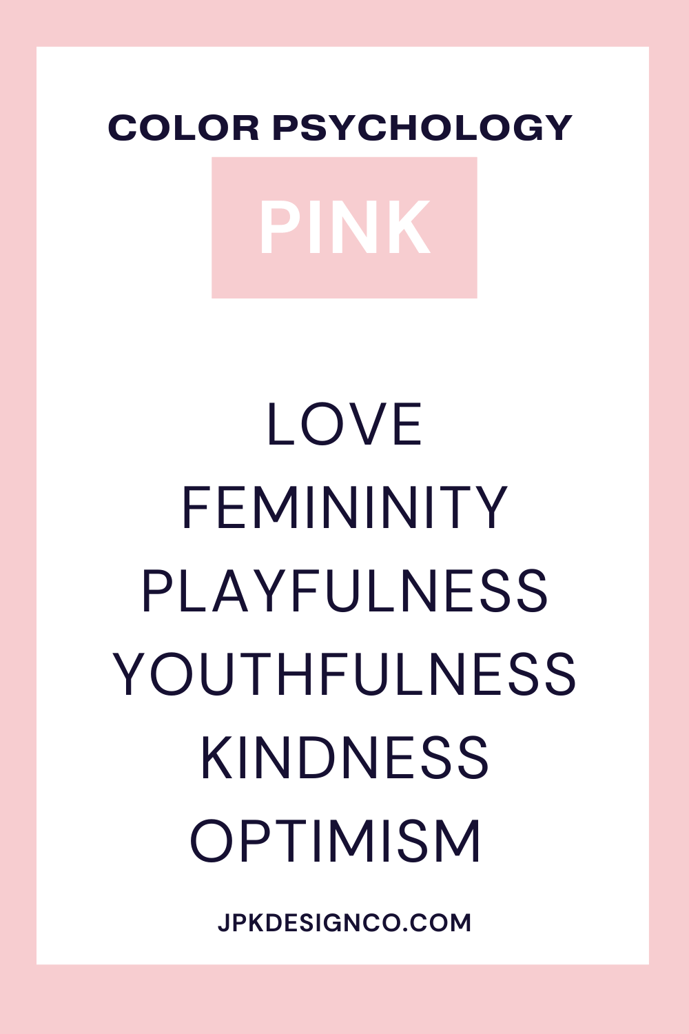
Pink: The Connection Curator
Associations: Love, romance, youth, softness
Pink ranges from delicate to vibrant, often used to create intimacy or make bold statements. Popular with female-identifying entrepreneurs in marketing and web design.
Brand Examples:
T-Mobile
Victoria's Secret
Lyft
Baskin-Robbins
Cosmopolitan Magazine
Brown: The Reliable Friend
Associations: Ruggedness, dependability, earthy, reliability
Brown can be challenging to use well but is gaining popularity in light and dark tans, especially for editorial-style websites.
Brand Examples:
Hershey's
UPS
Nespresso
UGG
M&Ms

Black: The Boss
Associations: Sophistication, edginess, strength, luxury, authority, formality
Black grounds your design while communicating elegance and luxury. Use it thoughtfully to avoid overwhelming your layout.
Brand Examples:
Nike
Apple
Gucci
Chanel
Cartier

White: The Space Creator
Associations: Freedom, simplicity, clarity, purity
White provides visual breathing room. Consider off-white tones for a softer effect. Popular with minimalist bloggers and healthcare industry websites.
Brand Examples:
Apple
Tesla
Burberry
Adidas
Nike

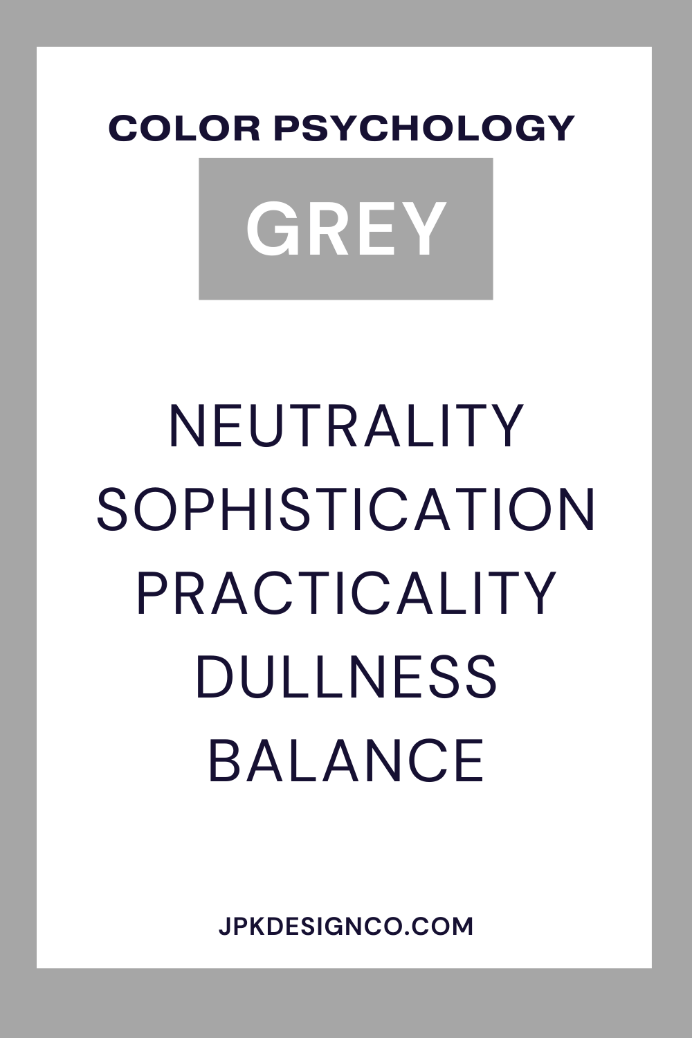
Gray: The Professional
Associations: Professionalism, calmness, stability, maturity, neutrality, sophistication
Gray provides a sleek, modern look suggesting formality and reserve. Balance it with brighter colors to maintain energy in your design.
Brand Examples:
Wikipedia
Mercedes Benz
LG
Nike
New Balance
I personally think understanding color psychology is one of those rabbit holes that's SO FUN to dive into. 🤓
Seriously, once you start learning about how colors affect our emotions and decisions, you just can't stop! It's such a helpful tool for business owners and creators who want to utilize all the things they can to create effective and engaging websites. And let's be honest - who doesn't want their website working harder for them while they sleep?
The Color Psychology Cheat Sheet
Colors shape how people feel about and interact with your website.
Remember:
Pick colors that match your message and the emotions you want to create. Your financial consulting business probably shouldn't use the same palette as a children's birthday party service, right?
Consider cultural meanings when designing for a global audience. What says "celebration" in one culture might shout "warning" in another!
Use colors strategically to support your website goals and guide visitor actions. Want them to click that "Book Now" button? Make it pop with a color that stands out from your main palette.
Color crisis? Book a Power Hour with me and I can share tips, tricks, or help you get a brand new accessible & gorgeous palette during our call!

