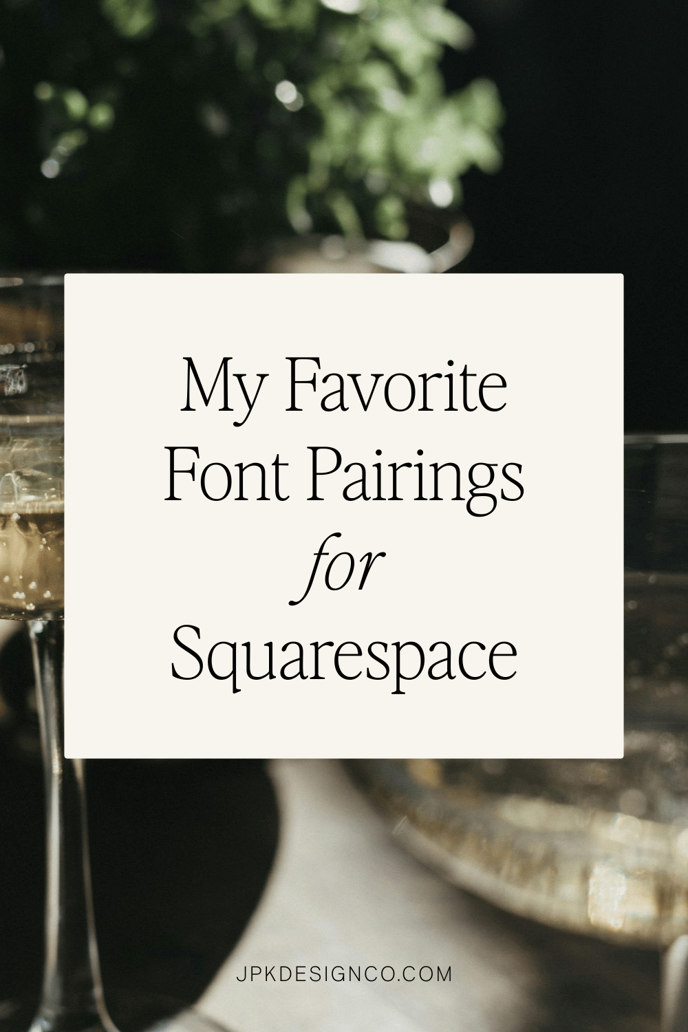
My Favorite Font Pairings for Squarespace (2026)
Table of Contents Show

Top Squarespace Font Combinations 2026: My Favorite Picks
UPDATE OCT 2025: Squarespace now lets you upload custom fonts directly and easily to your website, WITHOUT custom code. This is terribly exciting. Here’s more information from Squarespace about that.
UPDATE JULY 2025: Here is a new great free resource for ALL the fonts in Squarespace PLUS the fonts that are ALSO available in Canva.
UPDATE May 2025: As of February 2025, Squarespace retired 300 fonts from their collection. This update removes the discontinued font from the original post (ITC Avant Garde Gothic) and refreshes all pairings with the latest font trends! Here’s the full list of the discontinued fonts.
Hunting for that perfect font combo for your Squarespace website?
If you're midway through designing your website and don’t know what fonts to pick and find yourself thinking, "Wait...how on earth do I pick fonts that don't make my site look outdated or wonky? And how do I know what fonts actually look good together?"... that deer-in-headlights moment is real.
But good news: I've hand-picked seventeen custom Squarespace font pairings that'll transform your website from "did-your-grandma-make-this?" to "wait-how-much-do-you-charge?"
From sleek and modern to charming and creative, this list has you taken care of.
But first, let's clear up a quick question that secretly confuses almost everyone...
So What Is a Font?
A lot of people, if they think about it at all, don’t know the difference between a "font" and "typeface".
And they are related, but there’s also a difference:
Font: The specific version of a typeface. It includes size, weight (bold, light), and style (italic, condensed). So "Arial Bold 12pt" is a font.
Typeface: The overall design family. The general look of the letters. "Arial" is the typeface, which includes Arial Regular, Arial Bold, Arial Italic, and more.
Think of it like music:
The typeface is Abbey Road (the whole album)
Each font is a single song like Come Together
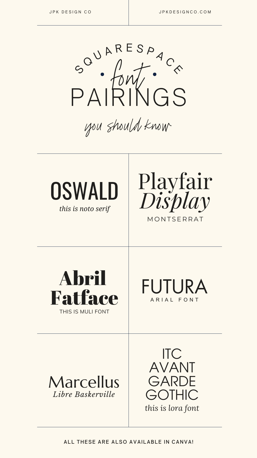
all these 6 font combos are in canva, too!
Squarespace Font Options
Squarespace gives you access to both Google fonts and Adobe fonts.
You've got four ways to use fonts in Squarespace:
Pick one of their ready-made font packs (fast, fine, a bit basic)
Mix and match fonts from their collection (fun, can get distracting)
Upload custom fonts you bought somewhere else (now easier than ever, but can slow down your site if you go overboard)
Combine approaches (upload a custom header font, use native standard body text)
Brief Font and Font-Pairing Guidelines
So you're probably wondering if there are some basic rules for pairing fonts to keep in mind.
The answer is absolutely yes!
But a quick word of caution: don't get stuck in analysis paralysis. If you start feeling overwhelmed, just pick something and move forward. You can always come back later.
Here are some quick tips that'll have you pairing fonts like a pro:
Quick Font Pairing Tips
Don't overthink it. If you get stuck, just pick something and keep going. You can always change it later.
Stick to 2-3 fonts max. More than that can look chaotic, and luckily Squarespace makes it easy to keep it simple.
Use contrast. Pick fonts that complement each other without competing:
Different sizes for headers and body text
Mix bold statement fonts with lighter, readable ones
Pair different styles (serif with sans-serif works great)
Serif plus sans-serif is classic. Serifs (letters with little feet) feel traditional and work well for body text. Sans-serifs (clean with no feet) feel modern and look good as headers.
Make it readable. Save decorative or script fonts for accents, not your whole site. And make text large enough that people over 40 can read it without pulling out their readers.
Match your vibe. A cute handwritten font might work for a kids' clothing boutique but would be weird for a financial advisor.
Stay consistent. Use the same fonts throughout your site. It looks more polished.
Test on mobile. Make sure your fonts look good on phones, not just your computer.
Check your license. Make sure you can legally use the fonts, especially for commercial work. This probably means purchasing a font you really love if you’re obsessed. Like I am with Jen Wagner’s fonts (affiliate link).
Think about accessibility. Some fonts are harder for people with visual impairments to read.
How to Assign Your Header & Body Fonts in Squarespace
Here's a quick two-minute video walkthrough showing you exactly how to add your header and paragraph fonts to your Squarespace website:
If you're more of a reader than a watcher, here's the step-by-step:
Log in to your Squarespace account: Start by signing into your account
Open your website editor: Click on the Squarespace website you want to update
Click the paintbrush icon in the upper right corner, or type /site-styles to jump straight to the font options (pro tip right there!)
Find the Fonts section: Under Site Styles, look for "Fonts"
Choose your fonts:
For headers, click on "Headings"
For your main text, click on "Paragraphs"
Browse and select fonts: Squarespace will show you options:
Font Packs: These are pre-selected font combinations (the lazy but safe option)
Custom Fonts: This is where you can mix and match different fonts for various elements (what I did in the video above)
To select and apply your own fabulous font combo:
Browse the list or search for specific fonts you already know you want
Click on your favorites to select them
Hit "Save" to apply these fonts to your site
Don't forget to update your button font, navigation, and other text styles throughout your site by clicking on 'Assign Styles'
Check your website: Take a peek at your actual site to make sure your new fonts look as amazing as you hoped!
How to Upload Your Own Custom Fonts in Squarespace New!(ish)
As of October 2025, Squarespace made it way easier to upload custom fonts. Here's how:
Open Site Styles, then click > next to Fonts
Click a font format (Headings, Paragraph, or Buttons)
Click the font dropdown menu, then click the upload icon
Drag your font file into the upload area, or click + to select it from your computer
Your uploaded font appears under "Uploaded" in any font dropdown
Supported file types: .otf, .ttf, .woff, .woff2
Important: Make sure you have legal permission to use the font on your website. Even free fonts sometimes require a paid license for commercial use. Check the license agreement before uploading.
To delete a custom font: First, make sure it's not being used anywhere on your site. Then find any font dropdown, click "Manage" next to "Uploaded," and delete the font or specific styles you don't want.
BEST Font Pairings in Squarespace
Alright, now for the good stuff: the actual font pairings!
I've put together 17 of my absolute favorite Squarespace font combinations that'll make your site look professional and on brand.
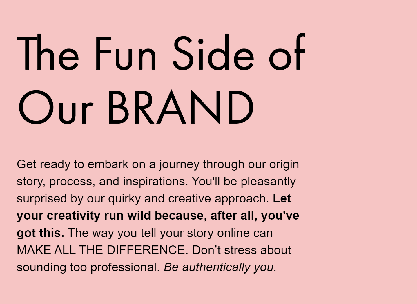
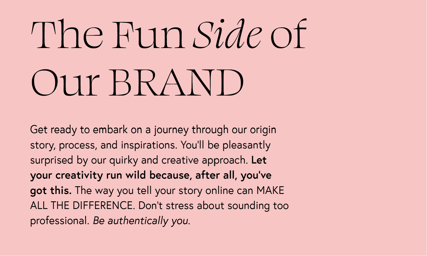
For consistency, I've used the same text examples for all fonts and included bold, italics, and uppercase variations so you can really see how they behave in the wild. All examples were created in one of my Squarespace templates, using the default font settings without any manual adjustments.
-
Weight: 400
Style: Normal
Line Height: 1.3
Letter Spacing: 0
Text Transform: None
-
Weight: 300
Style: Normal
Line Height: 1.4
Letter Spacing: 0
Text Transform: None
Squarespace Font Pairings
01. Termina / Libre Baskerville

01. Squarespace Font Combination: Heading: Termina / Paragraph: Libre Baskerville
Termina (a bold, modern sans-serif) meets Libre Baskerville (a traditional serif with serious literary vibes). It's like pairing sleek modern furniture with a vintage leather armchair: unexpected but somehow perfect!
Termina's bold presence catches your eye, while Libre Baskerville keeps everything readable and adds that touch of sophistication.
Ideal for: Businesses that want to look fancy without trying too hard:
Tech Consultant who wants to look approachable but smart
Historical Author or Blogger
Brand Strategist who's tired of the same old Montserrat/Lato combo
02. Ivy Presto / Sofia-pro

02. Squarespace Font Combination: Heading: Ivy Presto / Paragraph: Sofia-Pro
This is one of my absolute FAVORITES on this list! Ivy Presto and Sofia-pro together are like that friend who somehow makes even grocery shopping look glamorous. Ivy Presto brings that upscale, exclusive boutique energy with its elegant design, while Sofia-pro keeps things modern and readable.
It's the font equivalent of cashmere joggers; luxurious but not stuffy.
Ideal for: Brands that need to look polished but not pretentious:
Brand Consultant who charges $10K+ for their services
Fashion Photographer with a minimalist portfolio
Interior Designer who works with high-end clients
03. Cormorant Infant / Aktiv Grotesk Extended

03. Squarespace Font Combination: Heading: Cormorant Infant / Paragraph:Aktiv Grotesk Extended
Cormorant Infant is that elegant serif that looks like it belongs in a fancy mansion library (think Bridgerton vibes), while Aktiv Grotesk Extended brings a clean, approachable modern energy.
Ideal for: Businesses walking the line between tradition and trend:
Wedding Planner who works with modern couples but respects traditions
Graphic Designer with an appreciation for classic principles
Photographer who shoots film but edits digitally
04. Playfair Display / Montserrat

04. Squarespace Font Combination: Heading: Playfair Display / Paragraph: Montserrat
Is this combo overused? Maybe a little. Do I still love it? Absolutely! Playfair Display brings that 18th-century serif elegance (and those italics- chef's kiss!), while Montserrat offers that clean, contemporary sans-serif balance.
Montserrat is everywhere these days, but there's a reason for its popularity. Don't let its ubiquitousness scare you away, if it's the right fit for your brand.
Ideal for: Creating instant credibility with a modern twist:
Digital Content Creator who wants to stand out from the iPhone-video crowd
Personal Stylist balancing timeless style with current trends
Web Designer who appreciates the classics but isn't stuck in 2010
05. Orpheus Pro / Freight Sans Pro

05. Squarespace Font Combination: Heading: Orpheus Pro / paragraph: Freight Sans Pro
Orpheus Pro has these gorgeous flowing serifs that give me early 20th-century vibes (check out that 'Q' tail. Swoon.), while Freight Sans Pro keeps things grounded with its straightforward, no-nonsense design.
Ideal for: Making an impression that's both refined and relatable:
Copywriter who crafts timeless messaging
Professional Speaker balancing authority with approachability
Legal Consultant who wants to seem knowledgeable but not intimidating
06. Futura PT / Arial
06. Squarespace Font Combination: Heading: Futura PT/ Paragraph: Arial
This is another favorite combo of mine.
Both sans serif fonts, but they play so nicely together. Futura PT (first font on the moon, by the way!) brings those distinctive geometric shapes and sharp letters, while Arial adds that rounded familiarity that everyone recognizes.
Ideal for: A clean, fuss-free approach that lets your content shine:
Web Designer who believes in function over flashiness
Business Coach focused on practical and growth-oriented results
Online Educator who wants students focused on material, not distracted by design
07. Poppins / Steven Sans

07. Squarespace Font Combination: Heading: Poppins / Paragraph: Steven Sans
Poppins is like that perfectly round bubble letter you used to draw in middle school… but make it professional. It's friendly and approachable. Pair it with Steven Sans for a streamlined look, and you've got a combo that says "I'm professional but I also might have stickers on my laptop."
The clarity of Poppins in uppercase is particularly satisfying, like perfectly aligned desk supplies.
Ideal for: Businesses aiming for that perfect blend of professional and approachable:
App Developer who creates user-friendly solutions
Social Media Manager with a strategic approach
UX/UI Designer focused on intuitive experiences
08. Abril Fatface / Muli

08. Squarespace Font Combination: Heading: Abril Fatface / Paragraph: Muli
Abril Fatface is that friend who makes a statement just by walking into the room: it's big, it's bold, and it's not sorry about it. (In reality, it's actually inspired by those dramatic 19th-century advertising posters.) Muli, meanwhile, is the perfect wingman: understated and calm, letting Abril have its moment while keeping everything balanced.
Together, they're like the perfect dramatic eyeliner paired with a nude lip.
Ideal for: Making a statement without overwhelming your visitors:
Fashion Blogger who understands the power of a statement piece
Branding Specialist who knows how to create visual hierarchy
Lifestyle Photographer capturing bold moments in everyday life
09. Swear Display / Europe
9. Squarespace Font Combination: Heading: Swear Display / Paragraph: Europe
Swear Display brings dramatic flair to the table with its artistic serifs, while Europe keeps things crisp and welcoming with its clean lines.
Perfect for multi-passionates who are both sophisticated and down-to-earth, this combo creates a memorable impression without trying too hard.
Ideal for: Creative souls who want to stand out from the template-using crowd:
Creative product-based business with a unique vision
Creative Writer balancing artistic expression with readability
Music Producer blending classical training with modern sounds
10. Ambroise Std / Josefina

10. Squarespace Font Combination: Heading: Ambroise Std / Paragraph: Josefina
Can we just take a moment to appreciate that capital 'R' in Ambroise Std? Guh. Gorgeous!
This sophisticated serif with its sharp features pairs beautifully with Josefina's soft, friendly sans-serif vibe. It's professional but still approachable. (The italics in Ambroise Std deserve their own Instagram account, honestly.)
Ideal for: Creating an air of authority without intimidation:
Academic Research Consultant who makes complex topics accessible
Life Coach or Mentor balancing wisdom with warmth
Travel Advisor offering both luxury experiences and practical tips


11. Gopher Bold / Gopher Regular

11. Squarespace Font Combination: Heading: Gopher Bold / paragraph: Gopher Regular
Sometimes keeping it in the family works best.
Gopher Bold grabs attention with its confident presence (look at that perfectly round 'O'!), while Gopher Regular maintains the same DNA but with a lighter touch. Using different weights of the same font creates this cohesive vibe that's clean and intentional.
To use this combo, choose 'Gopher' for both Heading and Paragraph, then make all headings bold in the Site Styles section.
Ideal for: Making a bold statement while keeping everything cohesive:
Marketing Consultant with a strong point of view
Public Relations Specialist managing consistent messaging
Corporate Trainer who wants to be remembered
12. Agenda / IBM Plex Serif

12. Squarespace Font Combination: Heading: Agenda / paragraph: IBM Plex Serif
Agenda brings that modern sans-serif cleanliness that says "I file my taxes early," while IBM Plex Serif adds warmth and personality with its subtle serifs. It's put-together, but not intimidatingly so.
(PS: I actually love IBM Plex Serif so much it could easily be a header font instead!)
Ideal for: Professionals who want to appear competent but not cold:
Financial Advisor who simplifies complex concepts
Educational Consultant balancing expertise with accessibility
IT Consultant who speaks human, not just tech
13. Aktiv Grotesk Extended / Aktiv Grotesk Condensed

13. Squarespace font combination: heading: Aktiv Grotesk Extended / paragraph: Aktiv Grotesk Condensed
Aktiv Grotesk Extended creates this open, friendly vibe that welcomes visitors (the uppercase version is just lovely), while its Condensed cousin keeps things tight and efficient where needed. It's versatile but still cohesive.
Ideal for: Creating a clean, modern look that adapts to different content needs:
Graphic Designer showcasing visual hierarchy
Business Coach with a streamlined approach
Virtual Assistant who brings order to chaos
14. Oswald / Noto Serif

14. Squarespace Font Combination: Heading: Oswald / Paragraph: Noto Serif
Oswald stands tall and confident like that coworker who's never afraid to speak up in meetings, with its condensed profile commanding attention (check out that striking 'L'!). Meanwhile, Noto Serif brings the warmth with its classic serifs and refined details like that curvy 'Q' …. I’m beginning to realize I just love Qs. (Maybe in this analogy, Noto Serif is the personality hire.)
Together, they create this perfect professional-but-approachable vibe that says "I know what I'm doing, and I'm nice about it too."
Ideal for: Balancing authority with readability:
Journalist delivering important information clearly
Copywriter mixing concise headlines with engaging body text
Digital products shop owner with a clear value proposition
15. Fjalla One / Nunito

15. Squarespace Font Combination: Heading: Fjalla One / Paragraph: Nunito
Another favorite! Fjalla One brings that bold, condensed energy that demands attention, while Nunito softens everything with its gentle curves and friendly vibe. It's the perfect good cop/bad cop duo: one grabs attention, the other makes you feel comfortable.
This combination creates a website that stands out but still feels welcoming and easy to navigate.
Ideal for: Creating an inviting but dynamic online presence:
Fitness Coach balancing motivation with approachability
Wellness Blogger sharing both science and self-care
Travel Blogger mixing practical tips with inspiring content
16. Input Serif Narrow / Input Sans

16. Squarespace font combination: header: Input Serif Narrow / paragraph: Input Sans
Did you know Input was actually designed specifically for code? But it looks amazing on websites too! Input Serif Narrow brings this efficient, editorial vibe (perfect for detailed information), while Input Sans keeps things clean and uncluttered.
Together, they create this streamlined experience that feels both technical and accessible. Kinda like having a super-smart friend explain complex topics (or board game instructions LOL) in a way you actually understand.
Ideal for: Information-heavy sites that need to remain readable:
Journalist breaking down complex topics
Data Analyst making numbers meaningful
Copywriter balancing technical details with clear messaging
17. Tenez / Poppins

17. Squarespace font combination: header: Tenez /paragraph: Poppins
Tenez is seriously underrated.
Its elegant serif design (that capital 'R' makes me weak in the knees) paired with Poppins' friendly, modern vibe creates a perfect balance of sophistication and friendly accessibility. It's stylish, yet still welcoming.
Ideal for: Creating an impression that's both premium and friendly:
Boutique Shop Owner with curated but accessible products
Event Planner balancing luxury with practicality
Personal Brand Coach who helps clients find their unique style

Need More DIY Help?
Choosing fonts is just one tiny piece of the website puzzle. There's seventeen billion other things to check before hitting that publish button (only a slight exaggeration).
For more detailed help on publishing your Squarespace website without missing anything crucial, I've created a free checklist that covers everything from Squarespace-specific tasks to SEO to accessibility must-haves.
Snag your free copy here 👇