Squarespace Website Examples 2024
What are some fun & different Squarespace website examples?
I asked that question (to myself, and to the Googs) when I was just getting started in my web design biz, and it took me a fair amount of digging to find examples of websites I liked (or didn’t).
So I decided to do a roundup here of some great, unusual, funky, creative and/or fun Squarespace website examples. 😎
I wanted to show y’all websites that aren’t the easy-to-find first page SEO websites (that are AWESOME). But to dig a little deeper and find a variety of Squarespace website examples that you can look to for a dose of inspo as you’re designing a site - or wondering is Squarespace can customize as well as other platforms.
I put a call into a Facebook group I’m in that’s filled with Squarespace web designers. I asked for either their websites, or client websites that they built. And I loved all the responses!
For the examples below, I include:
Homepage banner
What they’re about
Something I love about each of them
Link to their website
I encourage you to click through to the sites that call out to you and poke around!
Now, yes, some of these websites are technically ‘competitors’ in the sense that there are other web designer websites listed. However! I believe that when we decide to hire a person to execute a service, we do so in part because of the connection with the actual human and personality behind the service. So I’m not going to shy away from featuring other designer’s work here. There’s someone out there for everyone.
PLUS, I’m a big proponent of fostering solidarity and lifting each other up as humans, women, designers, etc etc whenever we can, so I consistently prioritize and embrace this approach in business as well as life.
So without further ado —
Here are 8 Squarespace website examples
(and specific things I love about each of them):
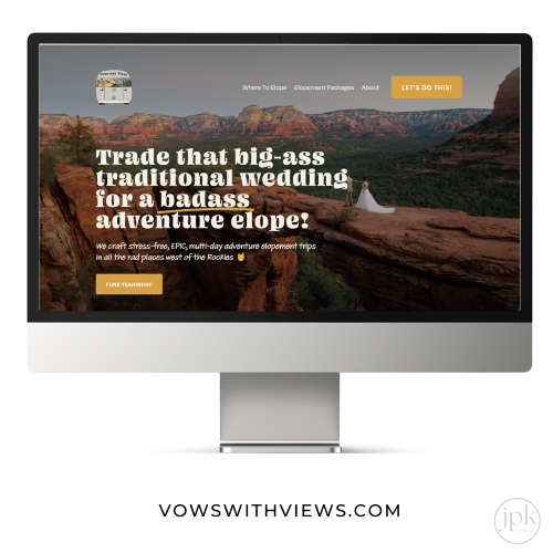
01 Vows with Views
What it’s about: stress-free, EPIC, multi-day adventure elopement trips in all the rad places west of the Rockies
What I love: OK first of all what DON’T I love?! The concept is so fun, and the build out and design showcases the exact outdoor/romantic/special experience you’ll get if you book an elopement package. The photos, branding, graphics and storytelling clearly convey what you’re getting, and the site is a dream to navigate. Plus the logo is absolutely charming.
What it’s about: Gut health go to support for stressed-out women with IBS
What I love: The gentle feel of the overall website. The designer did a great job of showing that the the practitioner is centered and passionate about what she does. The ‘5 bloat friendly breakfast recipes for IBS’ is a perfect freebie to offer - it has immediate value. And the custom gut health graphics are delicate and aligned nicely with the offering and the brand.
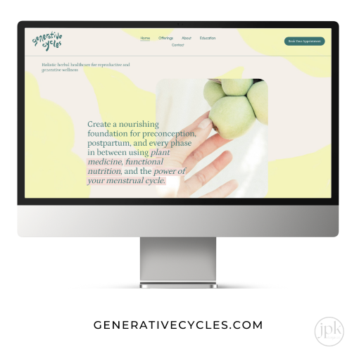
What it’s about: Holistic herbal healthcare for reproductive and generative wellness
What I love: As a natural health-focused website, this website feels like a soft and welcoming place to land. The offering and call to action are clear, and the FAQ on the bottom of the page answers a lot of questions that first-time visitors to the site might have. The fresh and pastel color palette conveys the tone and feel of both the website and the business.
What it’s about: Weddings and funerals without the naff: Melbourne’s ultimate party starter
What I love: First of all - Not related to the design, but the concept is just brilliant!
OK, now moving on to the design: The ‘above the fold’ section is supremely well laid out - tagline, photo, location she serves, clear CTA, and easy to read navigation bars. Klara’s vibrant personality absolutely shines through this whole website.
What it’s about: artistic branding, photography, and web design all in one place
What I love: the minimalist aesthetic, the custom font, and the clarity of the messaging and branding. The whole website is easy to navigate, and feels pleasurable to explore. It’s gorgeous, I just want to be friends with them! A+
What it’s about: Web Design: Building Eye-Catching & Strategic Designs To Help Service Based Businesses Make A Big Impact
What I love: You can tell Cassandra is obsessed with the details. Her peacock theme is represented in everything from images to headlines to - did you notice this? - the custom matching green slider that she created to match the rest of her site. She’s got all the necessary info right there, making it easy to tell what the website is about, and how to get in touch.
What it’s about: Aesthetic and strategic bespoke websites and digital solutions for creatives, visionaries, and collaborators
What I love: Nuri has her brand aesthetic and messaging DOWN. (Her company was named after her grandmother, Katherine, in case you were wondering, like I was!) You can tell there is a lot of thoughtfulness and strength behind this brand. And the aesthetics of her Instagram feed are 😍
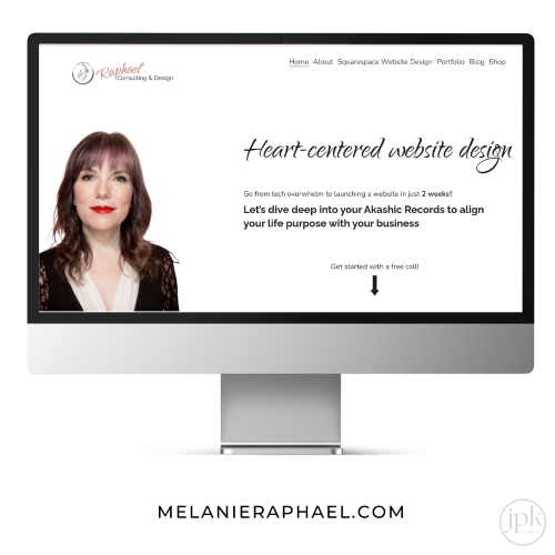
What it’s about: Heart-centered website design
What I love: Melanie’s hyper-focused niche! “Let’s dive deep into your Akashic Records to align your life purpose with your business” 💯 This is not a web design business for everyone, but for her ideal client, it’s absolutely perfect. Intuitive web design? For people for whom technology isn’t their strong suit? A website that’s aligned with your soul? So good. She infuses her style and personality throughout, like sharing her Enneagram and Myers Briggs, and labeling her legal pages ‘Legal Shit’ in a beautifully elegant font 👌
And that’s a wrap! 🌯
Hopefully these Squarespace websites across a variety of industries give you an idea of:
The amount of customization you can do with Squarespace (a lot!)
What different industry websites can look like
The wide array of talent on this earth
And gives you a dose of inspo for your own Squarespace website design!


