How to Create an Engaging 404 Error Page Design in Squarespace
What should be on a 404 error page?
When it comes to website design, one often-overlooked element is the 404 error page. While encountering a "Page Not Found" error can be super frustrating, a well-designed and customized 404 page can turn this experience around.
In this post, I share the importance of customizing your 404 page - with examples! — And sharing tips for you to create an engaging and informative 404 page (and why you want to).
If you want detailed steps on how to create a custom 404 error page in Squarespace, here’s a blog post about that.
But first — what is a 404 Error Page?
A 404 error page is also known as a "Not Found" page on a website.
An error page appears when a website visitor attempts to access a web page that doesn’t exist on your site for a variety of reasons.
Technical info: It’s accompanied by an HTTP status code "404" that indicates the requested page is not available. This happens for several reasons, both internal and external.
… and how does it happen?
01. Broken or outdated links
When your website undergoes changes like: you’re moving things around, deleting pages, or deleting posts, the links pointing to specific pages or posts may become outdated or broken. Clicking on these links will lead your website visitors to a 404 page.
02. Mistyped URLs
Your visitors may accidentally mistype a URL in the address bar, leading them to a non-existent page on the website. This can happen due to typos, incorrect capitalization, or missing characters. For example, typing ‘jpkdesignco.com/blogggg’ instead of ‘jpkdesignco.com/blog’ will take you to my 404 page.
03. External sources
Links from external websites, Google search results, or social media platforms like YouTube, Instagram, and Facebook can also lead users to 404 pages -- if the linked page no longer exists on the website or if your visitor types in the link incorrectly.
Why Customize Your 404 Page?
Customizing your 404 page isn’t just about slapping on a fancy fix to a dead end. It’s about flipping the script and turning those ‘oops’ moments into opportunities.
Here are five great reasons to make sure a customized 404 page is part of your website design, with examples shown below this section:
Five Reasons to Customize Your 404 Error Page Design
User Engagement
A well-designed and customized 404 page can engage your visitors, making them feel more connected to your website. By incorporating nice or funny images, interactive features, or creative content like buttons, links and guides, you can turn a frustrating error into an opportunity to engage and entertain your website visitors.
Like 20th Century Studios, who feature rotating stills from their films and funny captions. Google “20th Century Studios 404” and see what you get.
Branding and Personality
Customizing your 404 page allows you to show your brand's personality and maintain consistency in your website's design. By incorporating your brand colors, logos, and visual style, you reinforce your brand identity, making the error page feel like a natural extension of your website.
I love the Atlantic Magazine’s 404 page for staying on brand (image below).
Navigation and Guidance
A customized 404 page serves as a helpful guide for visitors who encounter a dead end. Include a big ol’ search bar to help people in finding what they're looking for. Additionally, you can provide clear navigation options, like links to popular pages or categories, to encourage your visitors to continue exploring your website. Also be sure to include a button leading back to the homepage.
Airbnb is a great example of including helpful links, including the home page, and a cute little ‘uh oh’ animation of ice cream falling off a little girl’s cone.
Error Communication
Generic 404 error pages don’t often provide enough information about what went wrong, which can lead to confusion, or just be annoying, haha. By customizing your 404 page, you can offer clearer and more informative error messages. Explain the error in a friendly tone, provide troubleshooting suggestions, or offer links to relevant resources that can help users find what they were looking for.
💡 TIP: Some websites put in a little form on their 404 page, asking their visitor what link they were looking for, so they can fix it. I love that!
Southwest Airlines 404 page (below) does a fun job offering a few different ways to get their visitors where they’re going, while also offering a little bit of topical humor.
Retention and Conversion
When visitors find a 404 error, they may just want to leave your website and find what they’re looking for elsewhere. Which is a bummer! Customizing your 404 page provides an opportunity to retain these people. Redirect them to other valuable content, encourage exploration of different sections of your website, or even offer incentives such as discounts or promotions to keep them engaged.
I love Kickstarter’s 404 page for offering a ‘randomized’ project to back.
404 Error Page Examples
Tips for Designing an Effective 404 Page
Now, let's explore some tips to help you create an effective and user-friendly 404 page design.
Keep it visually appealing
Design an attractive 404 page using graphics that pop, images that elicit a response (a chuckle response is the best, IMO!), and on-brand colors and typography. Ensure that the design aligns with your website's aesthetics to maintain a cohesive look and feel.
Make it informative — but concise
Provide clear error messaging in a concise manner. Avoid overwhelming your website visitors with lengthy explanations (pssst - just like the rest of your website design!). Use language that is easy to understand and quickly conveys that the page they're looking for cannot be found. You want to quickly guide them back to a useful page on your website.
Provide useful navigation options
Include a big search bar on your 404 page to let your visitors search for the content they were originally seeking. Other great things to include are: links to popular pages, categories, blog posts, or a site map to assist your visitors in finding relevant information.
Add a touch of humor or creativity
Use humor or creativity in your 404 page to alleviate user frustration and leave a positive impression. It’s important to make sure your humor or creativity aligns with your brand's tone and target audience thought!
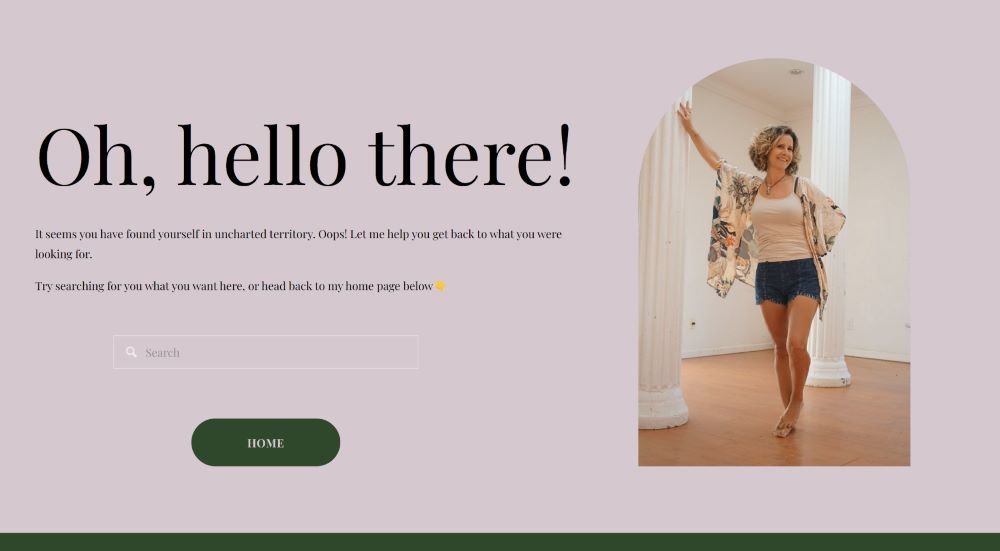
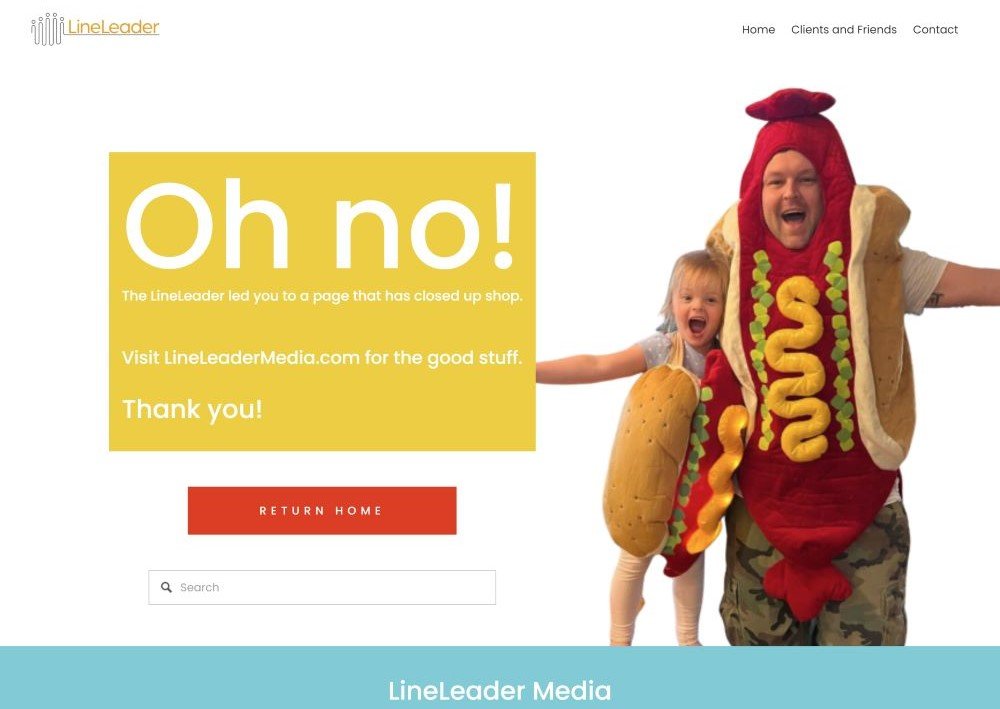
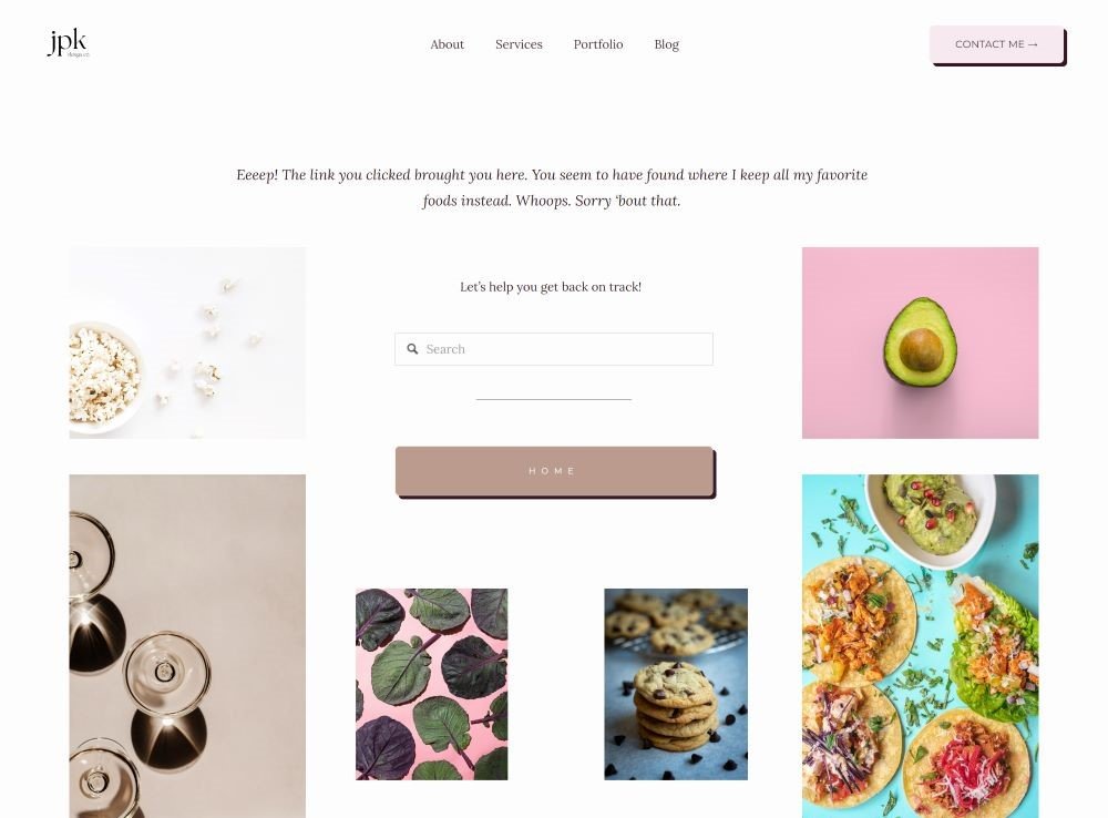
ExamplesHere are three 404 Error Pages I designed for my clients - plus an older version of mine:
Why you need a custom 404 Error Page, along with a collection of 404 Error pages to inspire you to create yours. You don’t need to rewrite the book or be someone you’re not - just bring a little of your own unique personality and/or a little humor or creativity, and you’ll be off to the races!


