These 5 Squarespace Design Mistakes Are Costing You Sales. Here's How to Fix Them.
Table of Contents Show
You've invested time and money into your Squarespace website, your offer is solid, but somehow the sales just aren't happening. Sound familiar?
Girl, I get it. 🙋♀️
After years of designing Squarespace sites and helping entrepreneurs turn their websites into sales machines, I've seen the same issues pop up again and again. And the truth: Most of them are totally fixable without a complete website overhaul.
That's right. You don't need to scrap everything and start from scratch. In most cases, it's just a few strategic tweaks that can dramatically improve your conversion rates and start turning those visitors into paying clients.
Soooo, let's cut to the chase and talk about the 5 most common Squarespace design mistakes I see that are literally costing you money.
And more importantly, let's talk about how to fix them!
Mistake #1: Your Homepage Doesn't Make Your Offer Clear
Oh man, this is a big one.
I can't tell you how many times I've landed on a gorgeous website and thought, "Wait...what do they actually do again?" And if I'm thinking that as a web designer, you can bet your visitors are even more confused.
See, what happens is we get so excited about ALL the things we offer that we try to cram everything onto the homepage. The coaching, the courses, the 1:1 services, the affiliate products, the free resources...
But here's the cold, hard truth (sorry!): when visitors can't quickly understand what you offer and how it helps them, they leave - usually within 7 seconds of landing on your page.
Seven. Seconds.
That's barely enough time to read your headline and maybe glance at a button. So if you're not crystal clear right from the get-go, you're losing them before they even get started.
How To Fix It
Focus your homepage on ONE clear value proposition. I repeat: ONE. Not three, not five. Just one main thing.
Your homepage should answer these questions immediately:
What do you do?
Who do you do it for?
How does it help them?
What should they do next?
Here's how to implement this in Squarespace:
Craft a headline that clearly states what you do and who it's for. Something like "Custom Squarespace Design for Service-Based Entrepreneurs" is way better than "Welcome to My Website!" or "Creating Digital Experiences."
Create a clean, focused hero section at the top of your homepage. Keep it simple with your headline, a brief description that explains who you help, and ONE obvious button. Squarespace's drag-and-drop editor makes this super easy.
Make sure your primary call-to-action is "above the fold" (the part visitors see before scrolling). Use button text that tells people exactly what happens next, like "View My Services" or "Book a Free Call”.
Your homepage isn't meant to tell your whole life story or showcase every single offer you have. Its job is to clearly communicate your value and guide visitors to the next step.
Related: Homepage Magic: Three Essential Tips to Captivate & Convert Visitors
Mistake #2: Your Website Navigation Is Working Against You
Let me drop a truth bomb on you: If visitors can't find what they're looking for on your site within a few clicks, they're gone. ✌️
And yet, I see so many beautiful Squarespace sites with navigation menus that are:
Overly complicated with dropdowns upon dropdowns
Using clever but confusing labels (like "The Experience" instead of "Services")
Missing obvious pages visitors are looking for (like pricing!)
Here's the thing: every additional click required reduces conversion rates by approximately 30%. So if potential customers have to click through three pages to find your services, you've already lost a huge chunk of them along the way.
How To Fix It
Keep it simple! Your navigation should be intuitive enough that an off-grid grandma could use it.
Here's what to do:
Limit main navigation to 5-7 items maximum. Any more than that and you're overwhelming visitors.
Use clear, standard labels that everyone understands: Home, About, Services, Portfolio, Contact. Save the creative naming for your blog posts.
Ensure your most important pages (the ones that lead to sales) are prominently featured.
To fix navigation in Squarespace:
While editing your site, hover over your navigation section and click "Edit Site Header"
Click on your navigation links, then click the pencil icon to access the settings
Here, you can drag and drop your links to reorder them, or click "Show Pages" to add or remove pages
If you need to rename links, simply edit the "Navigation Title" in your page settings
For mobile, click the mobile icon in the top right to preview how your menu looks on phones
Pro tip: Ask someone who isn't familiar with your business to look at your navigation and tell you where they would click to find specific information. Their confusion is your roadmap for improvement!
Related: Website Essentials: 5 Must-Have Elements for Online Success
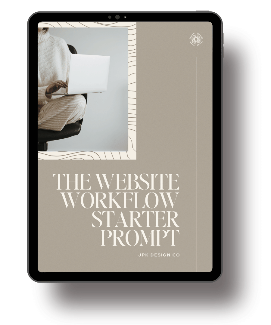
GET CLEAR STEPS + STRATEGIC GUIDANCE
Plan a website that works for your business.
Not sure what your website needs—or where to start? The Website Workflow Starter Prompt will help you get clarity and direction! This step-by-step guide includes AI prompts to map out your pages, layout suggestions to keep everything organized, and content tips to connect with your audience.
Mistake #3: You're Missing Strategic Calls-to-Action
Picture this: A potential client lands on your beautifully designed site, reads your amazing copy that speaks directly to their soul, gets excited about working with you...and then has no idea what to do next.
They scroll up and down the page looking for direction, but there's no clear next step. So what do they do? They leave. 😭
This happens ALL. THE. TIME. I recently helped a client add strategic CTAs throughout their site and their consultation bookings increased by 64% in just one month - without any other changes. That's how powerful this simple fix can be!
How To Fix It
Every single page on your website should have a purpose. And every purpose needs a corresponding call-to-action. No exceptions!
Here's how to implement this strategy:
Identify the main goal for each page on your site (contact, click, buy, etc)
Create a clear, can’t-help-but-click CTA that aligns with that goal
Use accessible, contrasting colors for buttons to make them stand out (but stay within your brand palette!)
Write action-oriented button text that describes what happens next
In Squarespace 7.1 Fluid Engine, here's how to create effective CTAs:
First, set up your button styles in Site Styles > Buttons (where you define how your primary, secondary, and tertiary buttons look)
Then add Button Blocks where you want your calls-to-action to appear
When adding each button, select which style to use (primary, secondary, or tertiary) based on its importance
Place your most important CTA "above the fold" so visitors see it without scrolling
TIP: Generic button text like "Click Here" or "Submit" doesn't tell visitors what's going to happen when they click. Instead, use specific action phrases like "Start Your Website Audit," "Book Your Free 30-Min Consult," or "Get the Complete Guide."
The best CTAs address objections right in the button text. So instead of just "Subscribe," try "Yes, Send Me Weekly Tips (No Spam, Ever!)"
Related: 56 Power Words that Pack a Punch | Three Things Your Website Needs Right Now To Book More Clients
Mistake #4: Your Mobile Experience Is an Afterthought
Let's be so real for a minute.
How often do you actually check how your website looks on a phone before hitting publish on changes?
If you're like most business owners I work with, the answer is... not often enough.
Here's why that's a huge problem: over 60% of global web traffic now comes from mobile devices (and as of October 2024, mobile devices in the United States specifically accounted for 48% of web traffic).That means most of your visitors are looking at your site on a tiny screen!
I had a client who couldn't figure out why her inquiry form submissions were so low despite solid traffic. When we checked her site on mobile, we discovered the contact form was practically unusable - tiny fields, labels getting cut off, and a submit button that was barely visible. Once we fixed it, her submissions increased by 55%!
How To Fix It
Your mobile site isn't just a shrunken version of your desktop site - it needs to be treated as its own experience.
Here's what to prioritize:
Test your entire user journey on actual mobile devices (not just the Squarespace mobile preview)
Make sure text is large enough (at least 16px) to read without zooming
Make sure buttons are large enough to tap easily with a finger (at least 44px x 44px)
Check that forms work perfectly on mobile
In Squarespace, here's how to optimize for mobile:
Use the mobile editor (the phone icon in the top right bar of the editor) to make mobile-specific adjustments
Simplify layouts for mobile: avoid complex multi-column sections
Consider hiding certain elements that aren't critical on mobile (you can easily tuck them behind other elements, or you can use CSS)
Test your navigation menu to make sure it's easy to use on a small screen
Pro tip: Create a simple mobile testing checklist and run through it every time you make significant changes to your site. Include items like: check text readability, test all forms, verify images look good, and make sure CTAs are visible without scrolling.
Related: Master Your Squarespace Game: 4 Must Do Tasks Before Going Live
Mistake #5: Your Website Loading Speed Is Literally Driving Visitors Away
We're all impatient creatures on the internet. I know I am! If a site takes more than a few seconds to load, I'm hitting that back button faster than you can say "conversion rate."
And I'm not alone. For every second your page takes to load, conversion rates drop by an average of 4.42%. If your page takes 5 seconds to load, you've already lost about 20% of your potential customers!
The biggest culprits I see on Squarespace sites? Massive unoptimized images (ie reallllly big, not resized), too many fancy fonts, and excessive animations that look cool but sadly slow everything down.
How To Fix It
Speed up your site with these simple but effective tweaks:
01. Optimize all images before uploading:
Resize images to the actual dimensions needed (not larger)
Compress images using a tool like TinyPNG or Squoosh
For Squarespace banners, aim for images around 2000px wide
For gallery images, 1500px is usually sufficient
02. Limit custom fonts to 2-3 maximum:
One for headings
One for body text
Maybe one accent font (if absolutely necessary)
Use Site Styles to remove any unused fonts - and if you’re using CSS, you can set the default fonts to Arial, Times New Roman, or Helvetica to make sure your site isn’t loading custom fonts that you’re not using.
03. Remove unnecessary animations and effects:
Be selective with parallax sections - the ones that move on scrolling (they're cool but resource-heavy)
Limit animated GIFs (or convert them to videos, which load more efficiently)
Simplify your homepage to focus on content, not flashy effects
Related: How to Optimize Images in Squarespace | Three Tips for Creating an Optimized Squarespace Website
Let's Get You Taking Action!
Alright friend, now you know the 5 biggest Squarespace design mistakes that are costing you sales. The question is: what are you going to do about it?
Let me make it super easy for you with this quick-win checklist:
Your Fix-It-Fast Checklist:
Clarify your homepage message and focus on ONE main offer
Simplify your navigation to 5-7 essential items with clear labels
Add strategic CTAs to every page (with action-oriented text)
Test and optimize your mobile experience
Speed up your site by optimizing images and removing unnecessary elements
Not sure where to start?
Here's my recommendation:
If you're getting traffic but few conversions: Start with Mistakes #3 (CTAs) and #1 (Homepage clarity). If your bounce rate is high: Focus on Mistakes #5 (Speed) and #4 (Mobile experience). If people aren't finding important pages: Tackle Mistake #2 (Navigation) first.
Most of these fixes can be implemented in an afternoon, and the impact can be immediate. I'm talking real, measurable improvements in how your website converts visitors into clients.
These fixes aren't just about making your site look better; they're strategic improvements that directly impact your bottom line. So start with just one of these fixes this week - I recommend beginning with your homepage clarity for the biggest immediate impact. Just that one change could dramatically improve how your website performs.
Related: How to Know It's Time for a Website Redesign
Need a little more help?
If you're looking at this list thinking "Janessa, I need someone to just tell me exactly what to fix on MY site," I've got you covered.
My Squarespace Website Audit service gives you a super detailed report of what's working, what's not, and exactly how to fix it. It's literally like having me look over your shoulder and point out all the little things you might be missing that are costing you sales.
Check Out My Website Audit Service →
Here's to websites that actually convert! 🥂

